|
|
Boston, MA E-mail: info@hotknifedesign.com Phone: (617) 401-7546 |
|
|||||
|
|
|
||||||
|
|
 |
 |
|
||||
|
|
|||||||
|
|
Published columns and articles written by the members of the Boston Web design firm, Hot Knife Design, Inc.At Hot Knife, we enjoy contributing to ongoing discussion in the design community—whether it be about information design, business practices, or the rapid change creative workers face day-to-day. Hot Knife President Jonathan Follett regularly writes about these topics and others in industry publications A List Apart, Digital Web, and UXmatters. |
|
|||||
A Practical Guide to Capturing Creativity for UX Published Published UXmatters, July 6, 2009 What’s It About? For UX professionals—and creative professionals in general—our ability to both stimulate creative thinking and capture it when it happens is a key aspect of our work process. Capturing creativity—that Aha! moment of inspired thought—is trickier than we’d like to admit. While some people might be able to be creative on demand, whether you’re a visual designer, interaction designer, information architect, or software developer, creativity is rarely something you can turn on and off as necessary. In fact, in my experience, creative moments often happen when you’re least ready to capture your ideas. If you view creativity as the melding and molding of disparate ideas into something new, a relaxed mindset is usually a key ingredient. Some creatives run, swim, or take a walk to achieve that mindset. You can have a great idea just as you’re nodding off to sleep, in the instant when you wake up, or even standing in the shower. ...This column explores a few low-tech and high-tech methods of stimulating UX professionals’ creativity and capturing creativity when it happens. Codifying the creative process for the digital industry is difficult enough. It helps to have techniques that make our most elusive asset—our insights and inspiration—easier to manage.... (more) The UX Customer Experience: Communicating Effectively with Stakeholders and Clients Published Published UXmatters, January 22, 2009 What’s It About? As UX professionals, ... while we focus our attention on the users of digital products, we can sometimes be remiss in our treatment of another important audience—the stakeholders and clients with whom we collaborate to complete our assignments and projects. Effective communication with stakeholders and clients is critical to the design process itself, but this is not a topic we often address... We can and should treat the elements of stakeholder and client communication as a kind of user experience. And we should design this experience for our UX customers so far as it’s possible to do so. ... We need to communicate our design ideas effectively with non-technical customers and keep them engaged in the design process. Investing time and effort in this area brings returns in the form of more efficient design cycles and better products. As UX professionals, we’re adept at envisioning the end states of our labors. Communicating our vision to our stakeholders and clients is critical to our long-term success.... (more) The world as the interface - location data and the mobile web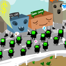 Published Published Vodafone Receiver Magazine, November 17, 2008 What’s It About? There is a world of information that we can't immediately see in the streets we walk and drive in, and in the buildings in which we work, play and live. The great potential of the mobile web – whether it is delivered by smart phone, automobile navigation system, or other device – is to reveal this hidden world to us, by adding geospatial and timing data to the user experience. In this way, the mobile web is poised to become the delivery mechanism for a new generation of location-aware applications... (more) Toward a More Human Interface: Integrating the Virtual and Physical Published Published UXmatters, October 20, 2008 What’s It About? ... In the physical world, we don’t have to think about manipulating an object—we just do it. Turn a photograph around on a table? Pick it up to take a closer look? Put it into a file folder? All of these are purely automatic actions. In the virtual world, though, we constantly have to think about how to take such actions. Does performing a particular action require a single click or a double-click? Can I drag that file to move it or launch an application, or do I need to use a dialog box? What’s the keyboard shortcut for magnifying images in this particular program again? In the real world, we don’t need to double-click a piece of paper to read it or move it. But in the virtual world, we require abstractions and use intermediaries to accomplish our tasks for us ... (more) Creating a Digital World: Data As Design Material Published Published UXmatters, August 18, 2008 What’s It About? ... The technological tools and resources with which we’re now familiar—such as search engines, Web applications, and notebook computers—could well be the digital-age equivalents of the industrial age’s steam engine and cotton gin. And just as the steam engine helped launch an era that altered the face of our planet, so, too, will today’s Internet-related technologies give rise to massive changes that we can now only imagine. ... But, as UX professionals, we have the advantage of seeing how these changes will happen—through greater access to data that will enable faster, more efficient decision making. As UX designers or researchers—we’ll be on the forefront of the movement to handle the coming flood of data—and make it not only available, but easy for people to use and understand. By designing great user experiences, we’ll break down barriers between users and the information they need or want at any given place or time.... (more) The State of the UX Community Published Published UXmatters, June 23, 2008 What’s It About? ...The nature of professional organizations is changing in significant ways. While the industrial revolution brought people together to work in factories and live in cities, the information revolution has allowed people to do the opposite—to work together, though geographically separated, on distributed teams. For knowledge workers, UX practitioners, and researchers, our professional organizations increasingly reflect this new reality. Some of our organizations operate almost entirely in cyberspace.... (more) Recycle These Pixels: Sustainability and the User Experience Published Published UXmatters, April 22, 2008, Earth Day What’s It About? ...Increased energy consumption, materials waste, and the resulting climate change are the chief difficulties our generation of designers and thinkers must address—or ignore at our own peril. But for most UX professionals, sustainability—unlike usability, technical feasibility, aesthetic appeal, and even business viability—is not yet a baseline factor that we take into account when designing a product or service. In honor of Earth Day—which occurs this year on April 22, 2008—let’s explore some different ways we can think about, influence, and change the design of digital products in ways that will alter both our own behavior and that of others and foster respect for our planet and its resources. (more) Show and Tell: Imagining the User Experience Beyond Point, Click, and Type Published Published UXmatters, February 25, 2008 What’s It About? ...we have now reached a point at which other technologies have begun to seriously compete with written language as viable methods for not only recording our ideas, but also interacting with the world around us. The nature of our communications is changing rapidly. Immersed in these changes as we are, it’s difficult to evaluate the rate of change, but audio and video are slowly superseding text. This is not to say that text is facing extinction—but its function as the primary means of conveying information is no longer certain. And while the rise of audio and video content preceded popular use of the personal computer, application software, and the Internet, the marriage of all these technologies is creating new forms of communication. One factor—the ability of software to recognize increasingly complex patterns like the nuances of speech and visual representations of people—provides us with possibilities for human/computer interaction that could vastly reduce the need for textual communication. What does this mean for designers of user experience? It means our tools for interaction are changing. The revolution the graphical user interface brought us will pale in comparison to the transformative change in user experience that’s on its way. (more) The Rules of Digital Engagement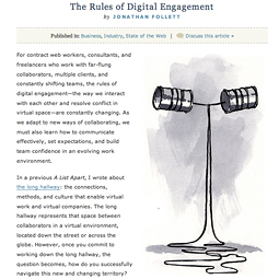 Published Published A List Apart, February 5, 2008 For contract web workers, consultants, and freelancers who work with far-flung collaborators, multiple clients, and constantly shifting teams, the rules of digital engagement—the way we interact with each other and resolve conflict in virtual space—are constantly changing. As we adapt to new ways of collaborating, we must also learn how to communicate effectively, set expectations, and build team confidence in an evolving work environment. In a previous A List Apart, I wrote about the long hallway: the connections, methods, and culture that enable virtual work and virtual companies. The long hallway represents that space between collaborators in a virtual environment, located down the street or across the globe. However, once you commit to working down the long hallway, the question becomes, how do you successfully navigate this new and changing territory? (more) Engaging User Creativity: The Playful Experience Published Published UXmatters, December 17, 2007 What’s It About? What makes a person want to use one particular digital product or service over its competitor? What makes one user experience more engaging, interesting, or compelling than another? An often overlooked, under-appreciated, and rarely measured component of user experience is playfulness. The digital space is conducive to play—exploration, imagination, and learning. And many successful digital products are built for play or incorporate play into their interaction design. No matter how important our jobs, serious our responsibilities, or stiff our personalities, all people need to play—whether we admit it or not. (Is the boss looking?) Playfulness, like usability, refers to a quality of user experience that can span many disciplines—information architecture, information design, interaction design, and graphic design. In our minds, however, many of us have relegated play to the realms of gaming or kids’ stuff and don’t consider play daily when designing. Though, in the digital space, satisfying the desire to play can be integral in determining the success or failure of a digital product or service. So it’s time for user experience designers to take play seriously. (And stop being so darn boring.) (more) Where Are You Now? Design for the Location Revolution Published PublishedUXmatters, October 22, 2007 What’s It About? ...There’s no doubt that the mobile experience has the potential to be far more than just the desktop Web reformatted for a tiny screen and accessible on the go. But looking at many of the products that major wireless carriers in the United States are touting, you wouldn’t think so. Much of the mobile industry is focusing on porting already existing digital content and services to the mobile environment, with a heavy emphasis on entertainment... The true power of the mobile Web lies not merely in providing remote access to data, but in letting users view contextual information relating to location and interacting with that information. The mobile Web is poised to become the delivery mechanism for a new generation of location-aware applications... (more) An Audience of One: Creating Products for Very Small Workgroups Published Published UXmatters, August 20, 2007 What’s It About? ...as our evolving information economy continues to encourage greater and greater specialization of job roles, there is an increased need for customized applications—digital systems that only a select few people will ever use. It’s now not only possible, but also economically feasible to produce customized digital products for smaller audiences. There are many UX practitioners—especially those within IT departments at small companies and government entities—who build applications for very small teams—even for audiences of one. And though the UX design process for the micro team or single user has many similarities to designing for larger user groups, it also has its own unique challenges. There might be a specific person or team your user interface must satisfy rather than a persona or user profile. So, no longer is your audience an abstraction, but a real person or team you must get to know and understand so well you can create a usable, elegant digital experience just for that audience of one. (more) Audio and the User Experience Published Published UXmatters, June 18, 2007 What’s It About? For most people, sound is an essential part of everyday living. Sound can deliver entertainment—like our favorite music or the play-by-play call of our hometown baseball—and vital information—like the traffic and news reports on the radio as we drive to work.... Since people are accustomed to such a rich universe of offline sound, it’s notable that our digital user experiences—while far from silent—do not leverage audio information to the same extent that they do visual information. When designers and developers create user experiences—be they for Web applications, desktop applications, or digital devices—audio is often a missing ingredient. (more) Interfaces That Flow: Transitions as Design Elements Published Published UXmatters, April 26, 2007 What’s It About? Actively influencing a person’s emotional state throughout an experience—in particular, his or her sense of anticipation, involvement, and desire for a certain outcome—is still an evolving concept in the realm of user interface design. However, this is very familiar territory for makers of music, film, television, and video games. While UX designers may not be storytellers, we can create more engaging product user experiences by learning from their examples. Many UX designers—myself included—approach projects from a combination of information architecture, information design, interaction design, and visual design perspectives. These disciplines and their methods are fundamentally different from those people use to construct the continuous linear narratives we see and hear in film, video, and music. However, as the technologies for creating interactive user experiences become more robust—especially in the realm of Rich Internet Applications (RIAs)—we have an opportunity to draw upon a much wider visual vocabulary. This will also make narrative elements such as timing, pacing, and rhythm increasingly important. Using such design elements may enable us to move users from mere understanding to engagement and, ultimately, to immersion in our digital products and services. (more) The Long Hallway Published Published A List Apart, April 24, 2007 What’s It About? You’ve heard of the long tail and the long walk home. Now, for all those micro design firms looking to grow to the next level, there’s the long hallway—the distance between the physical working spaces of the individuals that comprise virtual companies—which may be as short as a few miles across town or as long as thousands of miles across continents and oceans. (more) Envisioning the Whole Digital Person Published Published UXmatters, February 20, 2007 What’s It About? Our lives are becoming increasingly digitized—from the ways we communicate, to our entertainment media, to our e-commerce transactions, to our online research. As storage becomes cheaper and data pipes become faster, we are doing more and more online—and in the process, saving a record of our digital lives, whether we like it or not. (more) Seeing the World in Symbols: Icons and the Evolving Language of Digital Wayfinding Published Published UXmatters, December 18, 2006 What’s It About? Of all the objects that occupy our digital spaces, there are none that capture the imagination so much as icons. As symbols, icons can communicate powerfully, be delightful, add to the aesthetic value of software, engage people’s curiosity and playfulness, and encourage experimentation. These symbols are key components of a graphic user interface—mediators between our thoughts and actions, our intentions and accomplishments. In conjunction with information architecture, icons guide virtual wayfinding and help users to perform specific tasks efficiently. While the term wayfinding typically refers to orienting people in physical space—using graphics, text, signs, and other design elements—it’s useful to examine the use of icons through the lens of digital wayfinding, as a way of generating a fresh perspective on how users perceive and interact with their virtual spaces. (more) Interfaces for People, Not Products Published Published UXmatters, October 23, 2006 What’s It About? Without cooperation among designers of digital products, the proliferation of complex information systems can lead to unintended consequences—chiefly user fatigue, frustration, and the confusion that results from dealing with a host of variant user interfaces. We can describe nearly every aspect of human life as a system—from the biology of our bodies to the houses in which we live, the documents we read, and the maps we navigate. Our lives comprise many systems, and information technology is making our interactions with these systems increasingly complex. Until recently, most people knew little about many of the systems they encountered and relied on specialists to help them navigate them. We have relied on doctors to understand how our bodies work, accountants to understand how our finances work, and contractors to understand how our homes work. (more) Vision Quest Published Published Digital Web Magazine, August 14, 2006 What’s It About? While the web contains a vast quantity of multimedia content—photographs, audio, video, animations—the primary task required of most internet users is reading. From e-mail to instant messages to blogs to interactive forms, it is the ancient technology of written language that defines our communications and drives the information economy. More writing is created on and read from the computer screen than
ever before, but the displays that have dominated the marketplace have
left both creators and viewers of content in a consistently frustrating
low-resolution environment. Display 2.0: A Look Forward to the High-Definition Web and Its Effect on Our Digital Experience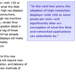 Published Published UXmatters, August 14, 2006 What’s It About? The computer displays we use for viewing our digital world have evolved relatively slowly in comparison to other types of computer hardware and Internet infrastructure— processor speed, bandwidth, and storage capacity have all made leaps forward in the past decade. While such improvements have shaped the way designers create and what they create—affecting everything from visual style and site architecture to interaction flow and overall functionality—these changes have been incremental and manageable. However, our move to high-resolution displays will be transformative, because it will affect designers’ entire working medium. Digital designers will face numerous possibilities and challenges that huge increases in screen real estate and depth of detail will bring. Instead of a somewhat blurry and indistinct 72-pixels-per-inch working environment, high-res displays will provide richness and clarity. As high-res displays become more readily available, digital designers will find themselves at the forefront in navigating this new world. (more) Understanding the Unconference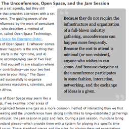 Published Published Digital Web Magazine, August 8, 2006 What’s It About? Unconferences are gaining popularity in the high-tech community as self-organizing forums for idea sharing, networking, learning, speaking, demonstrating, and generally interacting with other geeks. The unconference format is based on the premise that in any professional gathering, the people in the audience—not just those selected to speak on stage—have interesting thoughts, insights, and expertise to share. Everyone who attends an unconference, such as those put together by organizations like BarCamp or BrainJams, is required to participate in some way: to present, to speak on a panel, to show off a project, or just to ask a lot of questions. As an event, the character of the unconference falls somewhere between that of a bazaar and that of an intellectual salon. It is, to borrow a phrase, a free “marketplace of ideas.” There are no themes or tracks to guide you, as in a typical conference; the whole event is centered on what might be called the discussion group. The ad hoc nature and the low cost of this forum (they’re usually free, compared to the hundreds of dollars needed to attend some industry gatherings) make the unconference accessible to many. (more) Why the Tech Industry Needs to Change Its Language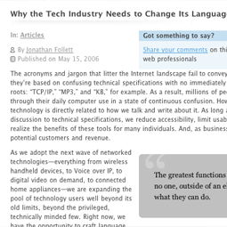 Published PublishedDigital Web, May 15, 2006 What’s It About? The acronyms and jargon that litter the Internet landscape fail to convey meaning because they’re based on confusing technical specifications with no immediately recognizable language roots: “TCP/IP,” “MP3,” and “KB,” for example. As a result, millions of people fumble their way through their daily computer use in a state of continuous confusion. How we think about technology is directly related to how we talk and write about it. As long as we are limiting the discussion to technical specifications, we reduce accessibility, limit usability, and ultimately fail to realize the benefits of these tools for many individuals. And, as businesses, that means we lose potential customers and revenue. (more) All material copyright © 2003 - Hot Knife Design, Inc.
|
|||||||
|
|
|
|
|
|
|
|
|